Katch Juice - Rebranding
RebrandingIdentity
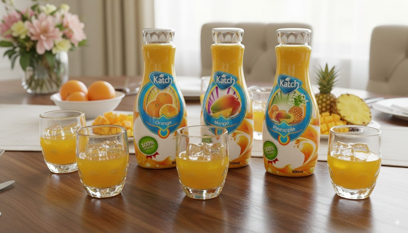
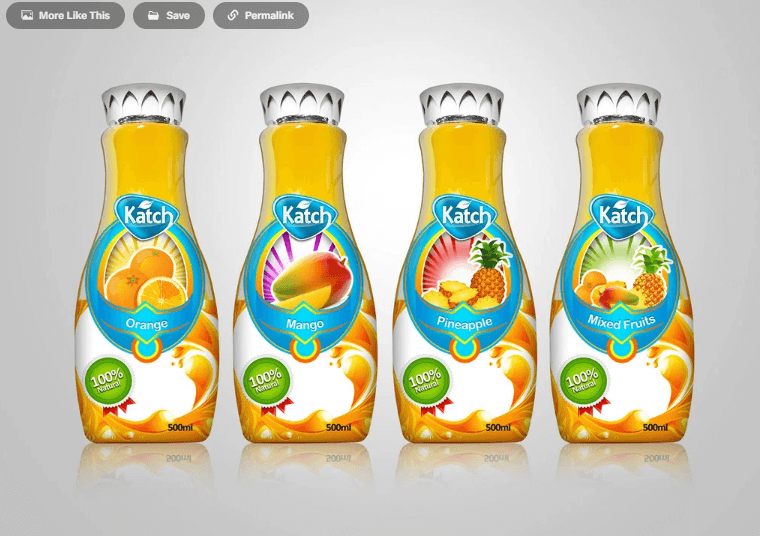
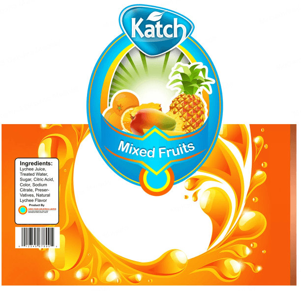
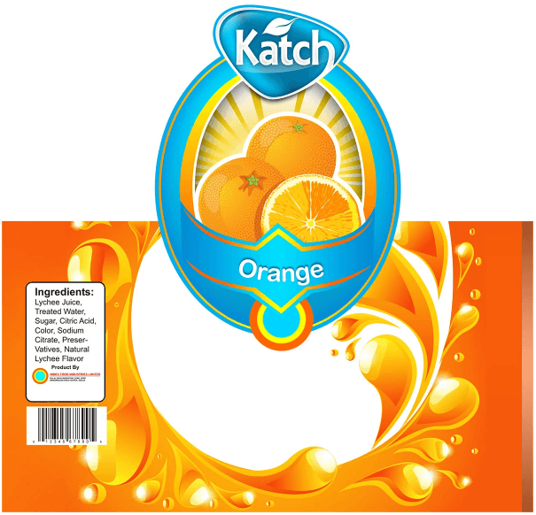
Katch had the product but not the presence. The rebrand gave it a fresh, modern identity - a distinctive leaf-marked logo, a sleeker 500ml bottle and flavour-coded labels - that finally looks as natural and premium as what’s inside, and sits as comfortably on a breakfast table as on a shelf.
What it's for
A full visual-identity rebrand for a juice brand - a new logo, bottle and flavour-coded label system. It is meant to give the product a premium, recognizable presence that extends cleanly across packaging, shelf and marketing.
Tools & software
drawCorelDrawimageAdobe Photoshopview_in_ar3ds Max
Designed in CorelDraw and Photoshop, with the 3D builds modelled and rendered in 3ds Max and Corona.
Highlights
- check_circleA distinctive blue logo with an elegant leaf mark
- check_circleA sleeker, redesigned 500ml bottle
- check_circleFlavour-coded labels with bold fruit imagery
- check_circleOne unified, extendable visual system
More views
Like this work?
I design packaging, spaces, brands and the products around them. Let's talk about yours.
Get in touch arrow_forward